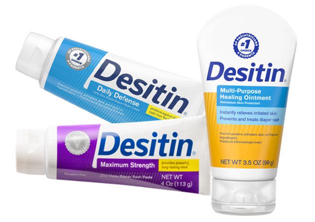
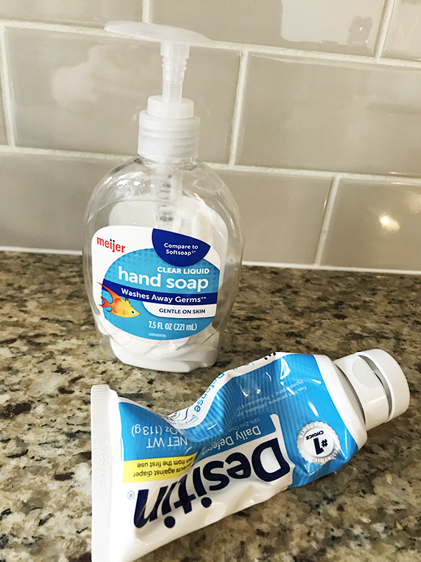
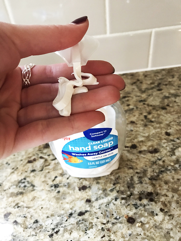
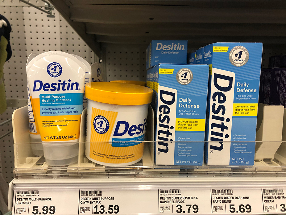
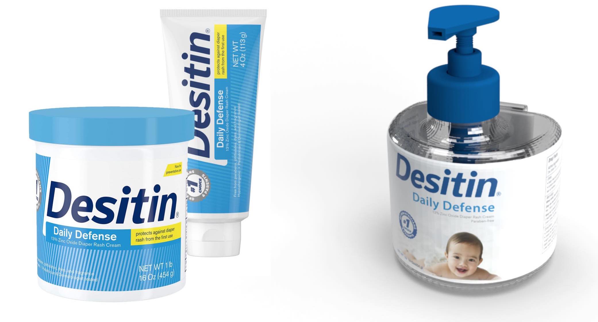
When walking through the baby isle of the grocery store, I noticed that diaper rash cream only came in a tube or tub. Why are the diaper cream products packaged differently from the baby lotions and shampoos? What could be changed to improve lives? Together, a small team consisting of another graphic designer, a plastics engineer, and myself, set out to create a new solution for Desitin diaper rash cream.
Background Research
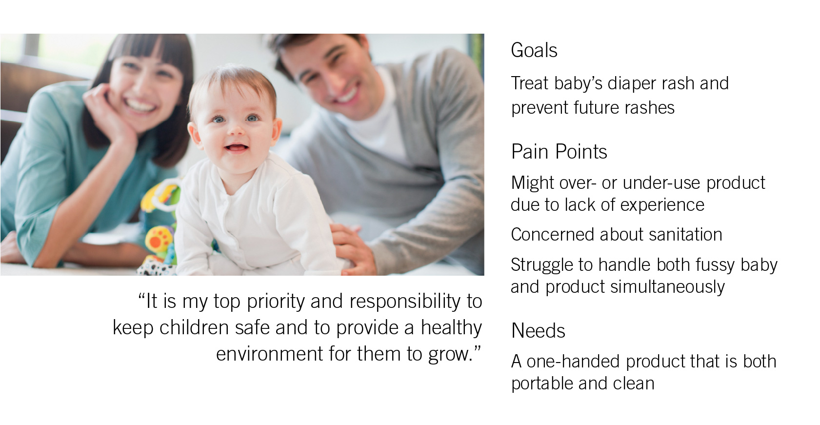
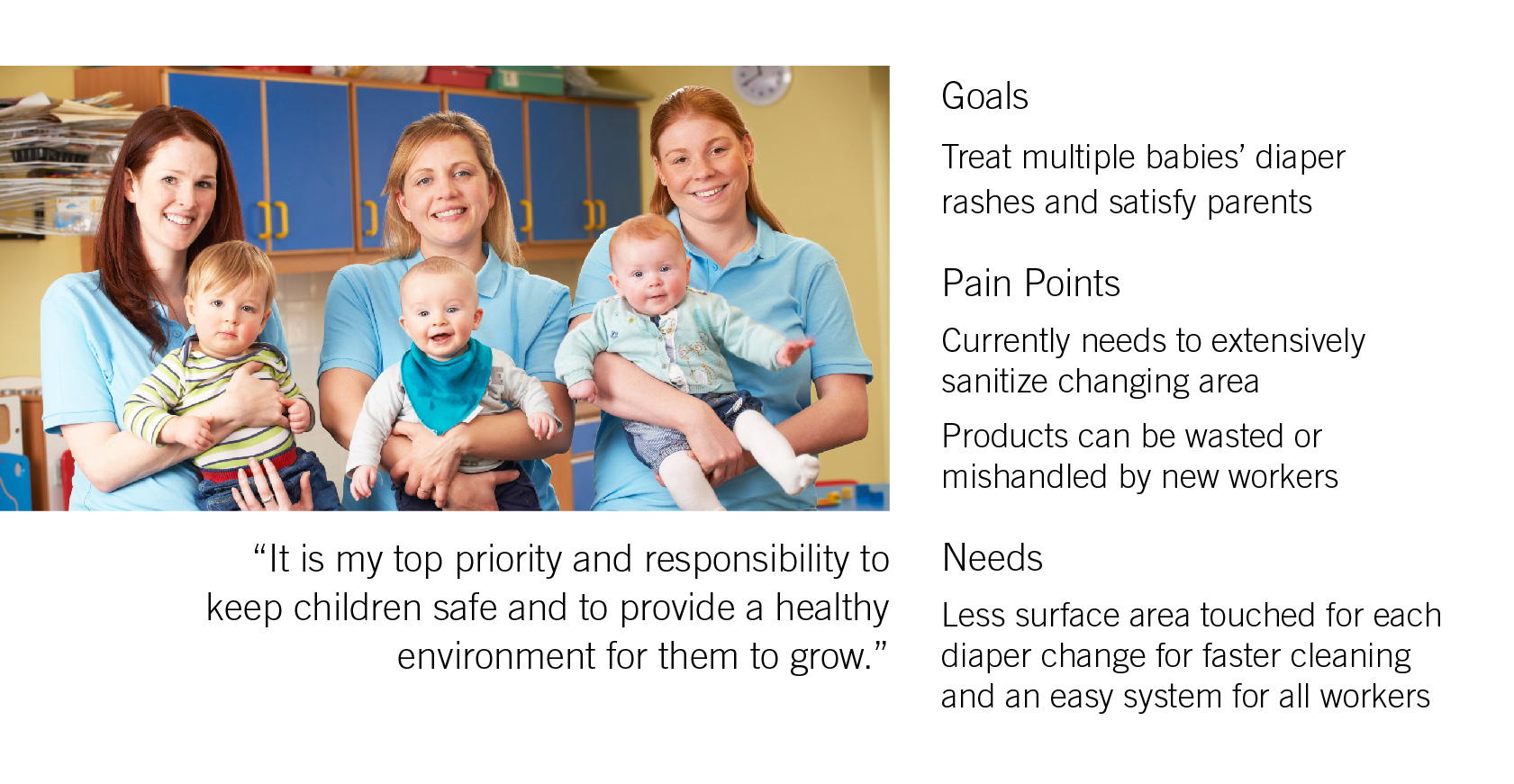
Desitin’s current brand values are love, education, support, comfort, and protection. We wanted to communicate these values in our new packaging ideas and show the brand’s commitment to providing safety, sanitation, and ease when caring for children’s needs.
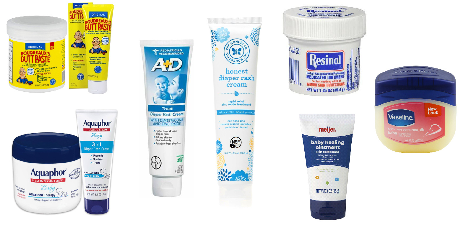
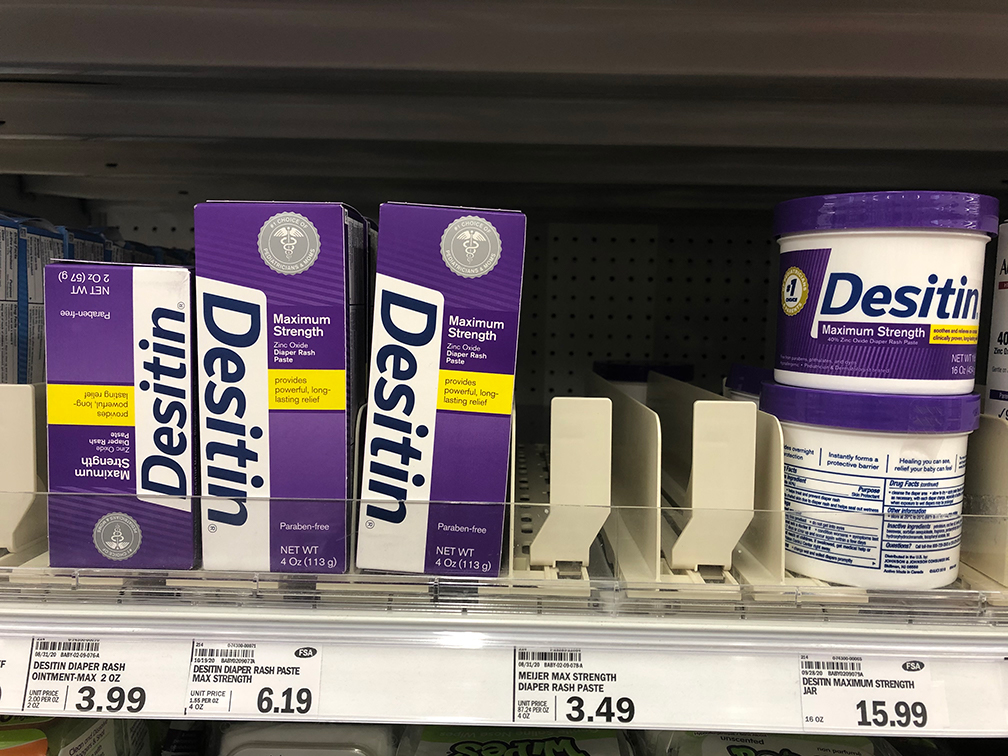
Overall, all of the competition is either packaged in tubs or squeeze tubes, which begs the question: is this the best solution, or is everyone just going along with everyone else?
Background Research
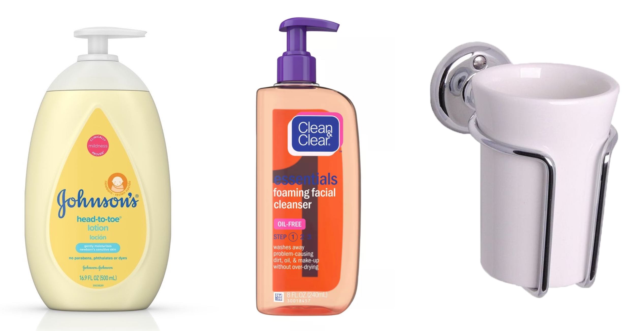
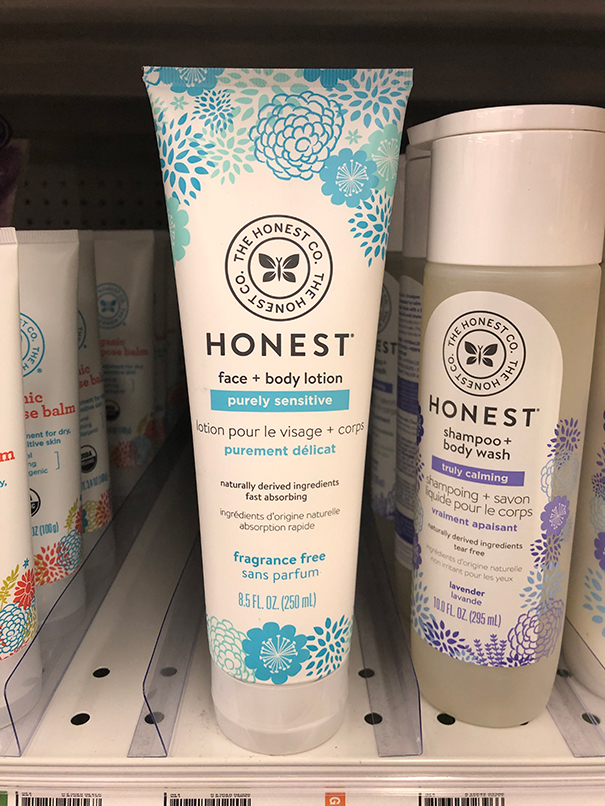
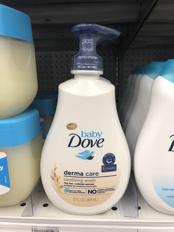
Johnson & Johnson’s baby lotion has the closest consistency comparison to diaper rash cream. The lotion bottle has a larger pump mechanism for thick lotion to flow through easily.
Clean & Clear’s bottle in the middle features a twist-locking mechanism, which would be good for traveling with the diaper cream.
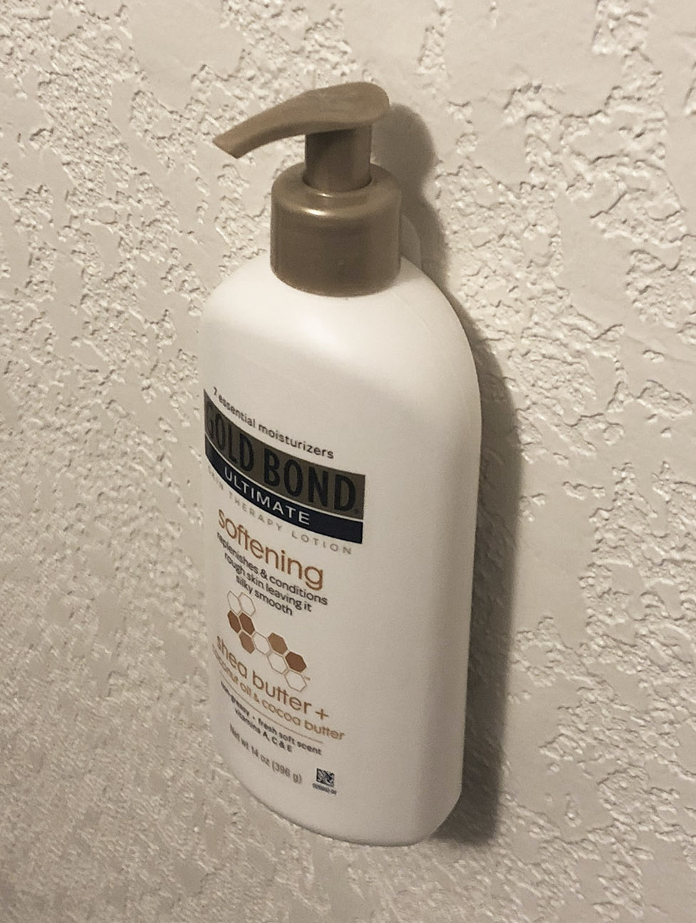
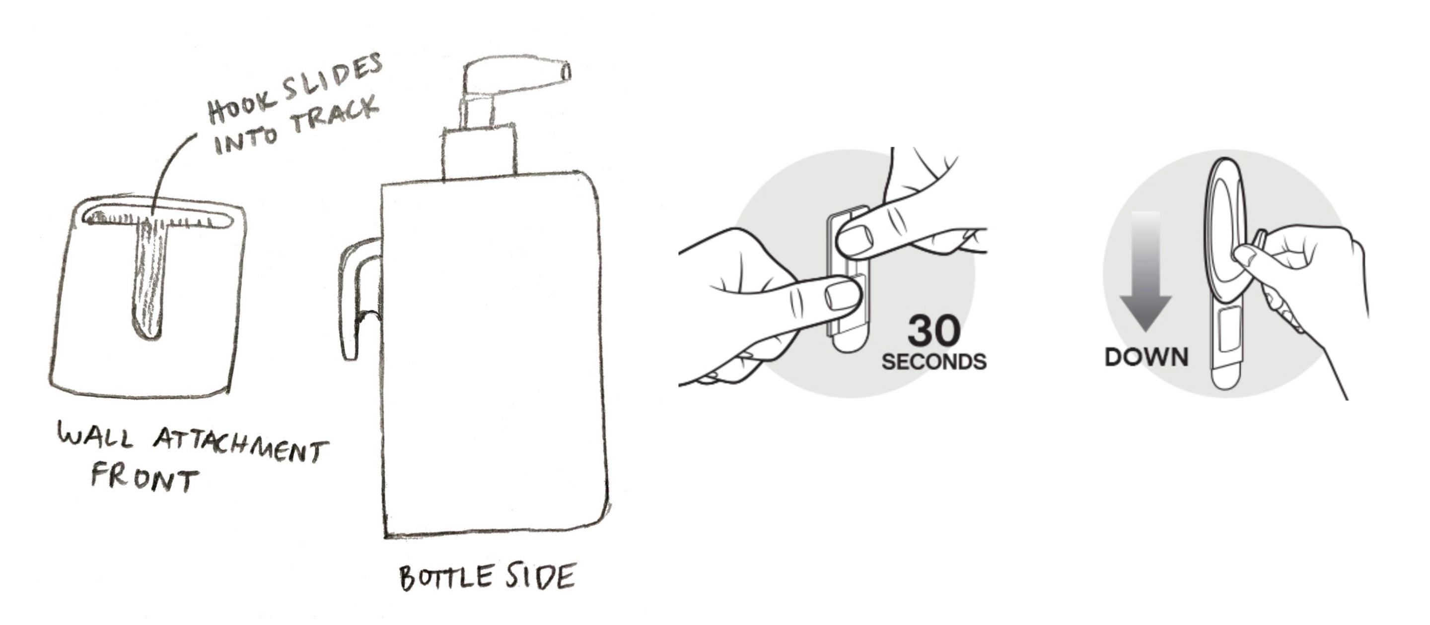
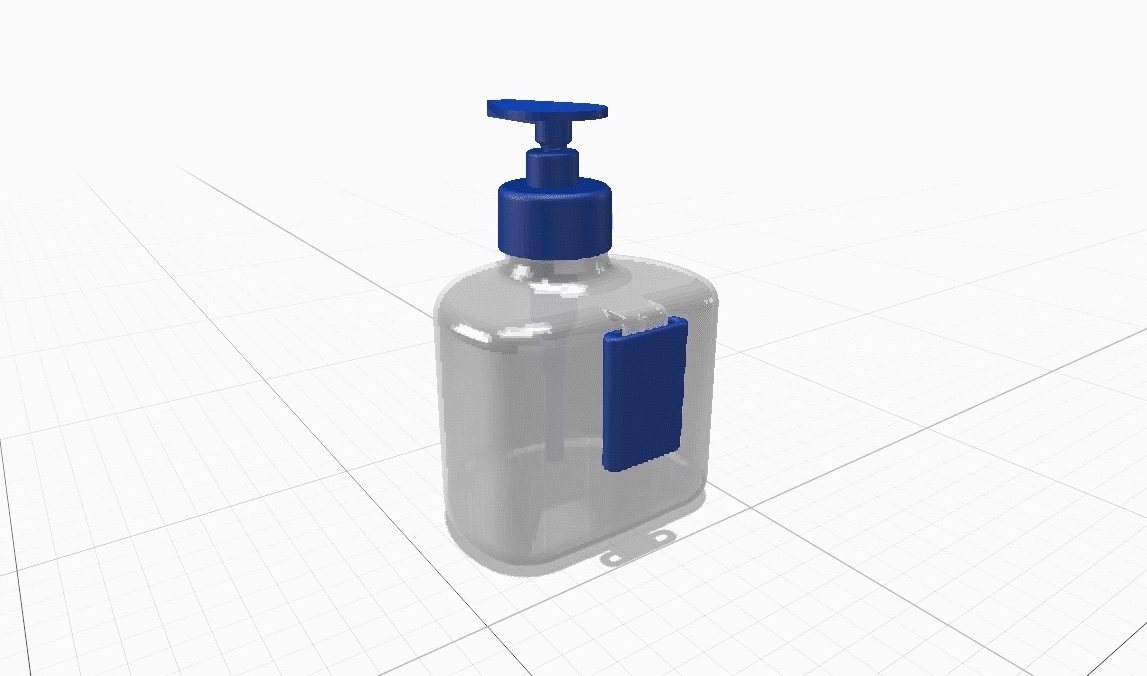
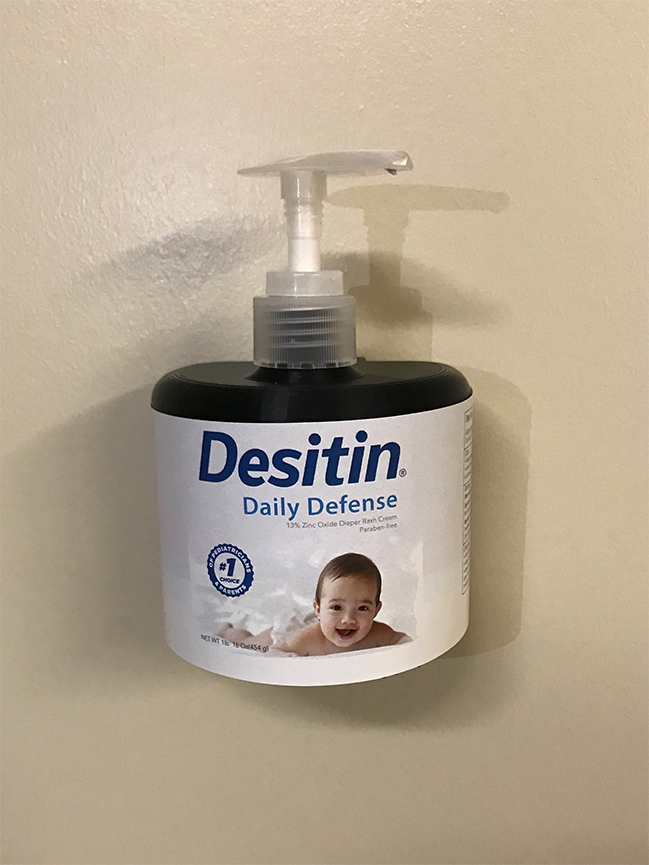
When thinking about how to make the process of applying diaper cream one-handed, my group and I considered the possibility of attaching the pump to the wall, using inspiration from wall-mounted toothbrush holders.
Testing and Prototyping
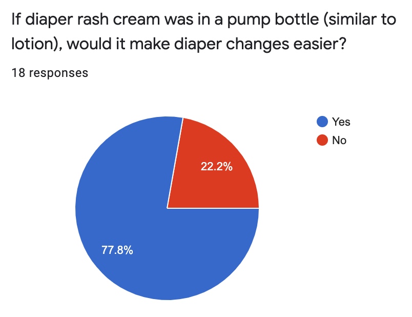
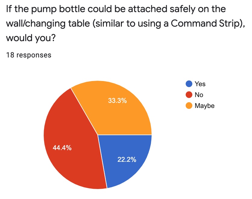
With the new idea a pump bottle and attaching it to the wall, I added more questions to the survey.
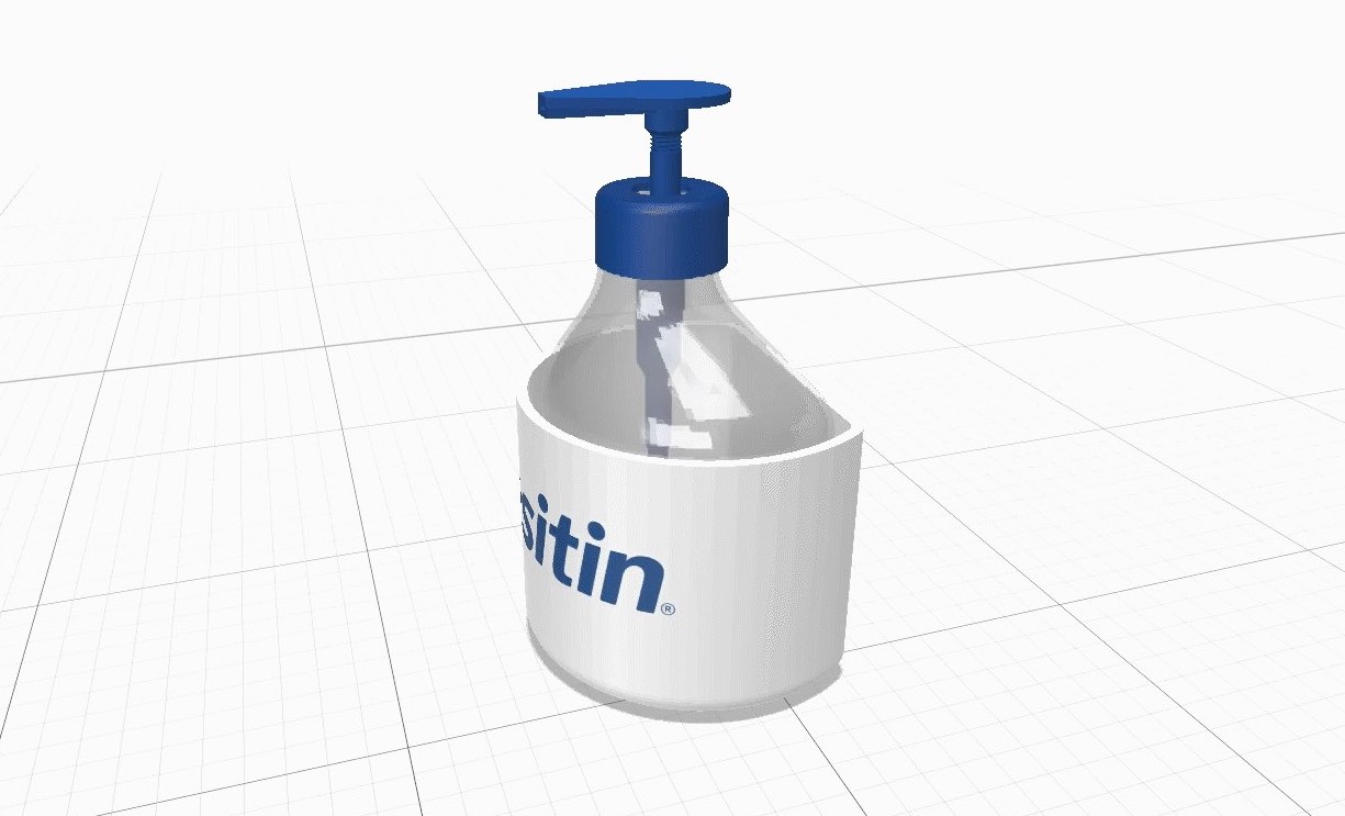
Based on the feedback of the survey, my group and I tried to find a better way the bottle could attach to the wall without having to manufacture and package a holder separately. The separate cup holder meant more plastic being manufactured with each bottle; or, it meant parents had to purchase the cup and bottle individually, which made buying diaper cream a bigger hassle than before.
After having a solid bottle shape to work with, my graphic design partner and I began creating new labels for the bottle.
Creating a Label
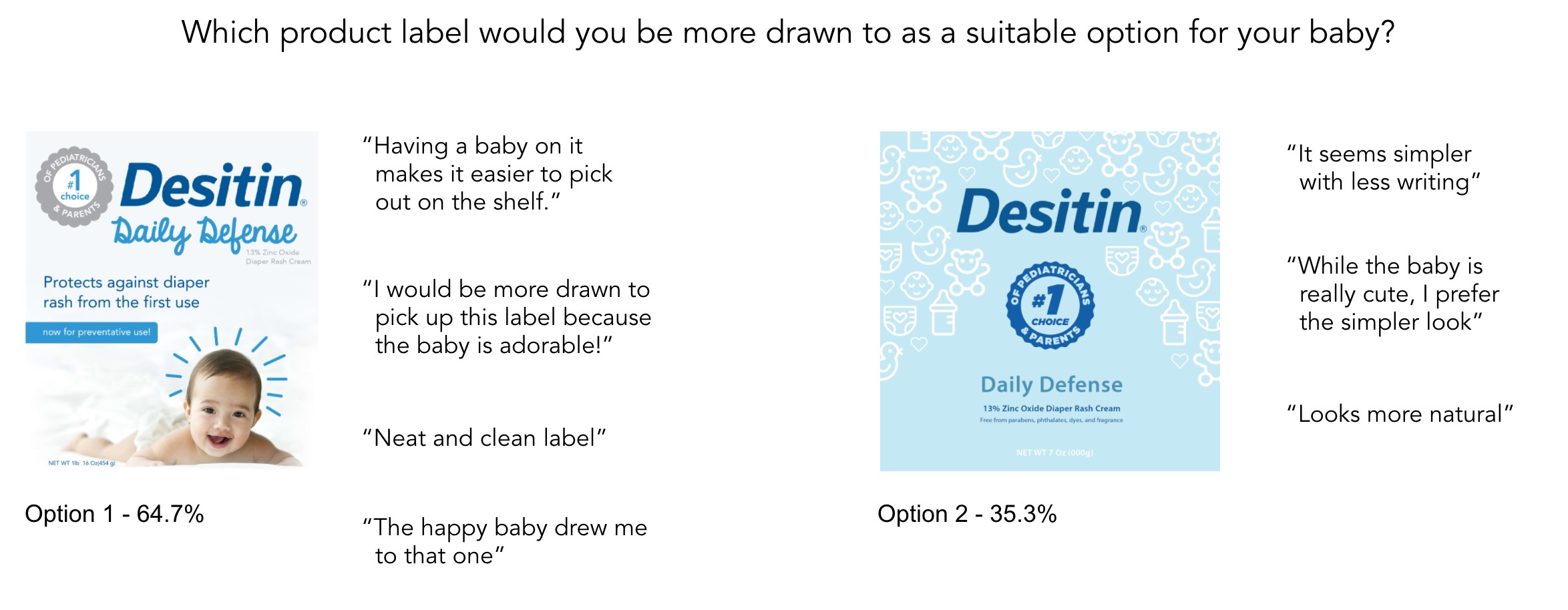
When interviewing some parents about what they looked for in a product label, they wanted it to look natural, and “like water that does something.”
My partner also designed a set of labels that she thought best reflected what parents wanted to see. With the two different labels, we conducted A/B testing to determine which option parents saw as a more suitable option for them and their baby.
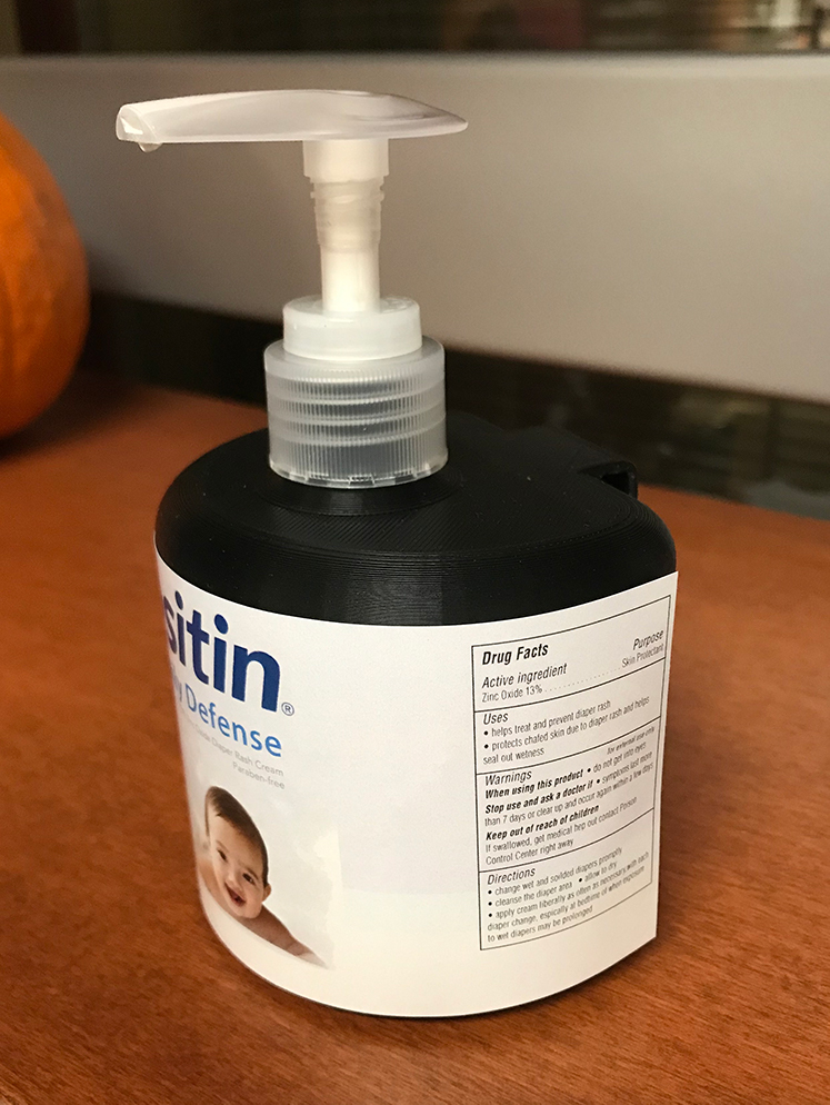
Printed Prototype
Printed Prototype
Moving Forward
In the future, I would like to conduct more user testing on more parents to get a wider range of data and insight on how to further improve the pump bottle system. Using the 3D printed model, I would love to give it to parents and see what they think of the pump bottle diaper rash cream and get their honest opinions of it in use.
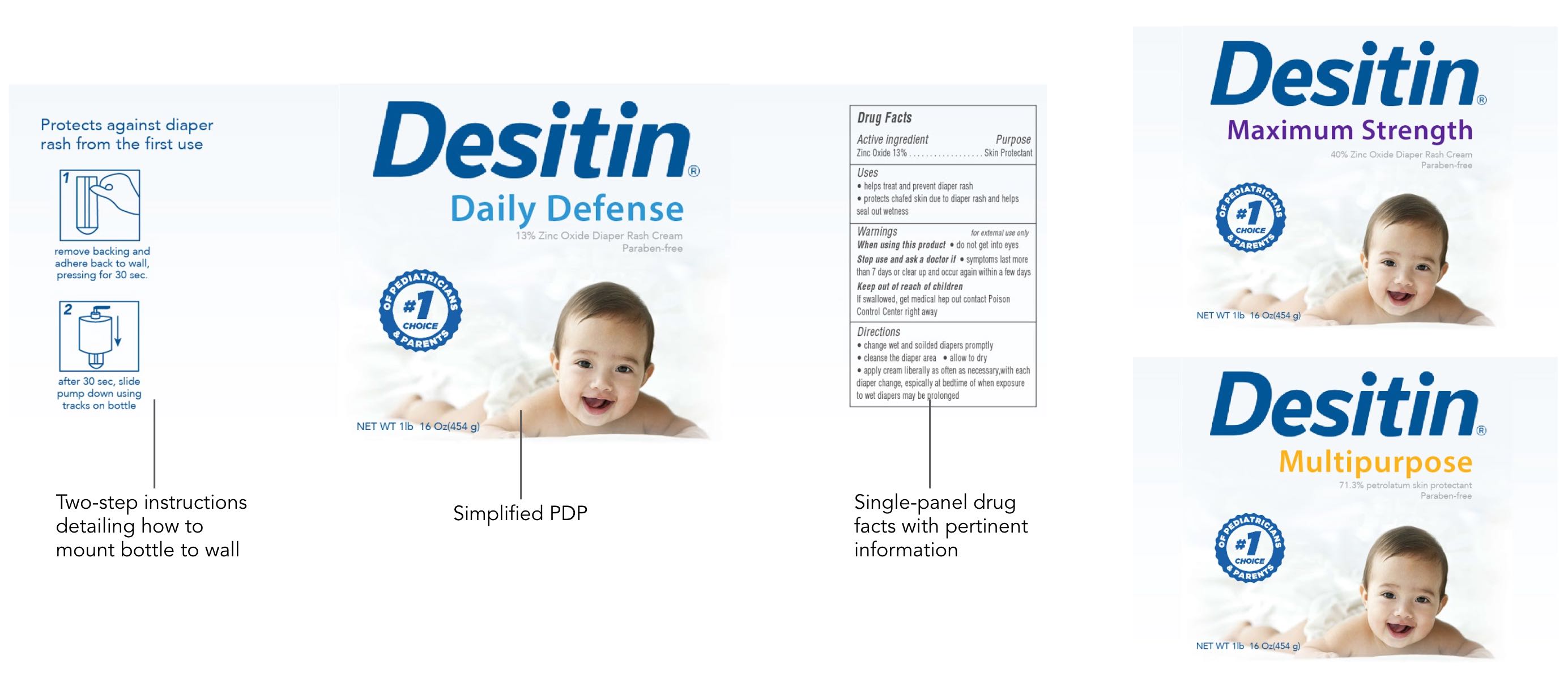
I plan on iterating upon the the label design to make the instructions on the side panel more clean, as well as create a pull tab; this would allow users to peel back the label and see a second layer that reveals all of the ingredients in more depth.